19 Mid-Century Modern Wall Decor Ideas That You Will Love
Mid-century modern is a sweeping decorative category, for architecture, furniture, and art. It’s a broad category that includes designs from about 1945 to 1969. And it’s a category that’s both classic and fashion-forward.
Characteristics of the style are geometric and abstract shapes as well as natural and organic silhouettes for chairs, couches, and tables. Colors are usually neutral with a lot of wood pieces or accents. But the style incorporated vivid, intense colors as well. Mid-century modern designers believed form follows function – pieces have to work, but have to look good as well, and more, have to elevate the household items around them.
Explore how to add a touch of mid-century modern wall art to your current look. It’s sometimes playful, sometimes serious. But from the kitchen to the living room, mid-century prints, paintings, and other wall artwork invoking the middle of the last century is always stylish and will update a room instantly.
A Great Place to Start
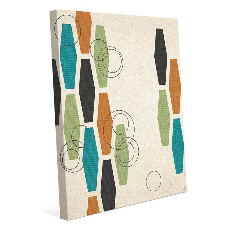
This is an absolute classic pattern from mid-century modernists – an understated honeycomb in the iconic palette from the era – turquoise, olive, black, cream, and an earthy orange. Wrapping the canvas around the sides of the frame adds depth and movement as your eye passes over the piece.
The canvas piece would be terrific on its own in a bedroom or den. It’s also the perfect mix-and-match piece to bring other shapes and complementary colors into the room.
Absolutely Iconic
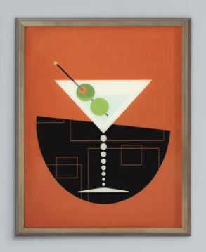
A tipsy martini would be right at home decorating a wet bar or kitchen. The classic colors are there – olive, orange, black, and white. The geometric notes are there as well, in the circles of the stem, and the slightly boozy tilt to the half-circle background.
Whimsical and so true to the spirit of the Mad Men, and all those three-martini lunches. This canvas is sure to make a splash on your wall, alone or paired with other mid-century artwork.
Wonderful Wood Panels
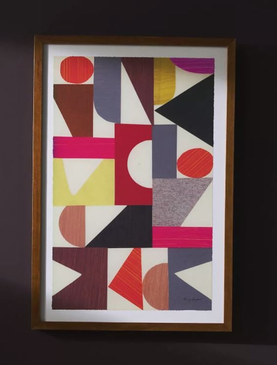
Geometric shapes are an appealing aspect of mid-century modern. Plus, a lot of the furniture made at the time was designed in Denmark and other European countries and made from wood.
You can evoke both trends of the era with this paneled piece. Group these nine 16” tiles made from Baltic birch in a tight or loose square, or create your own unique mosaic to compliment your room.
Naughty Kitty
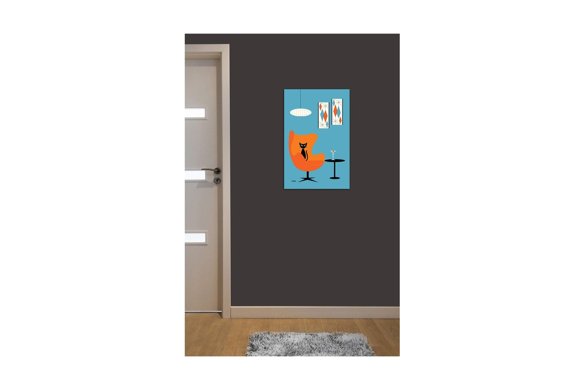
This slinky black cat, surrounded by eye-popping orange and turquoise is a stylistic nod to all things cool in the mid-1950s. In this gallery-wrapped canvas, the diamond panels and organic shapes in the lamp and chair provide pure kitsch, and we simply love it. Perfect for a mini-bar, or den, the colors will pop against wood paneling or a solid white wall. Martini, Kitty? One olive or two?
Lines and Colors
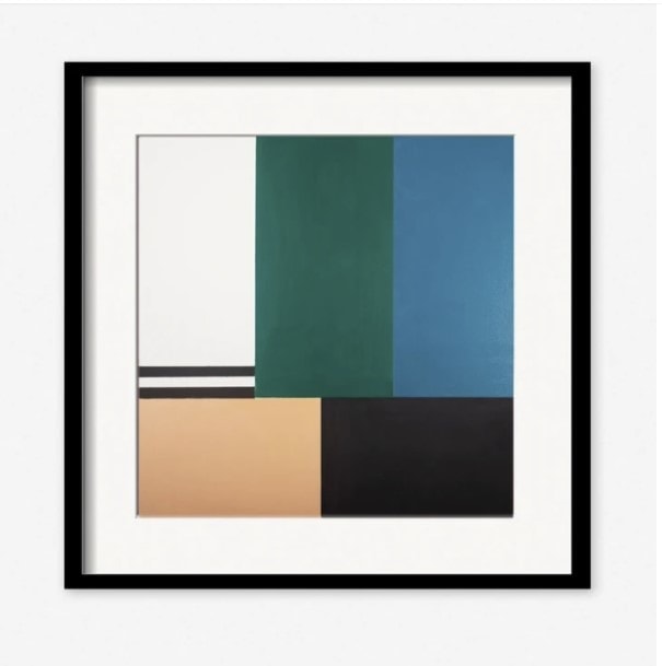
Part of the charm of the mid-century modern color palette is that it’s both neutral and bold. There’s room for black, white, and beige. But there’s also room for the bold use of color to balance out the white spaces.
This print reminds us of Piet Mondrian, a Dutch-born painter who practically invented abstract art. Use a piece like this alone on the wall, grouped above a desk or reading chair with a side table. It would also look right at home paired with other wall art from the era.
Some Like it Hot
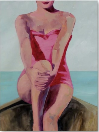
Realism was not a big part of the mid-century movement, but this appreciation of feminine curves is too good to pass up. The heart-shaped neckline, the classic one-piece bathing suit, and her sultry little smile, all bring to mind Marilyn Monroe in her most popular roles from the 1950s. Add this stunning pastel-infused portrait to a bedroom wall, or to enhance a masculine, wood-paneled study. Don’t blame us if fireworks ensue.
Organic Ovals
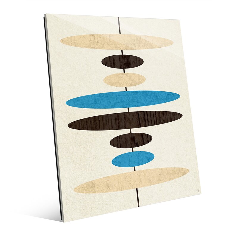
An image like this couldn’t be simpler, and yet it’s hard to look away. Shimmering ovals connected by a vertical line in rich royal blue and wood accents. Come to think of it, you could hang this either vertically or horizontally in your den or any paneled room.
And the organic shapes will work well with any mid-century modern furniture piece you have, maybe over a credenza or a drinks trolley. Feel free to mix with other artwork that’s angles and lines for a great combination.
Atomic Sparkles
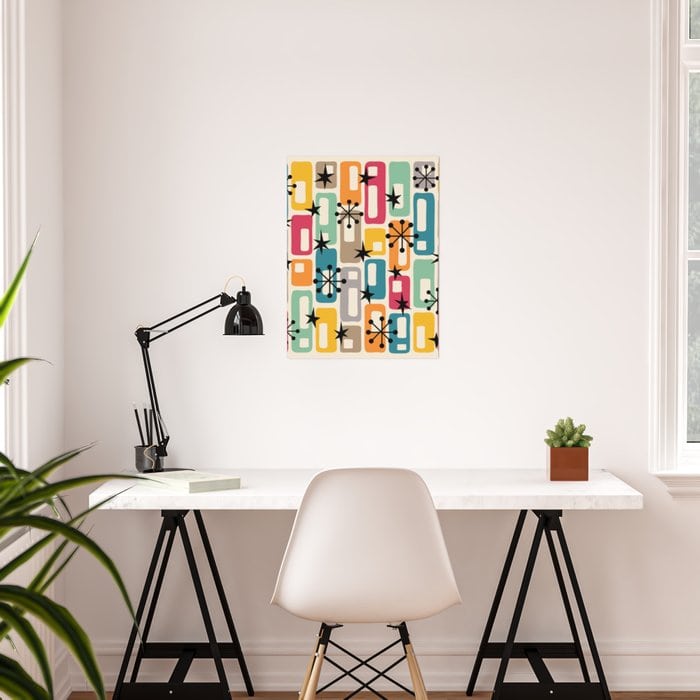
Atomic energy captivated the public’s imagination during the era, and idealized nuclear symbols quickly showed up in art and design.
This poster hits all the right notes – the capsules in an eclectic color scheme, and the starburst pattern radiating energy and movement. This will look good over your desk, in a hallway or bathroom, or hanging next to other retro artwork. Framed in white or black, this will really showcase your style.
Minimalist Butterflies
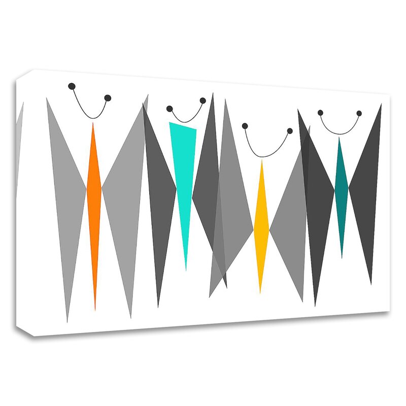
We can’t help but smile when we look at these colorful, geometric butterflies. Is that a grin or an antenna? Either way, this gallery-wrapped canvas showcases abstract design at its best – with just a few minimal shapes and clean lines, you introduce color and energy to your wall.
Consider adding this to a hallway or entryway. Maybe group with items that reflect the colors in the canvas, especially the muted gold and stunning black.
Retro Time
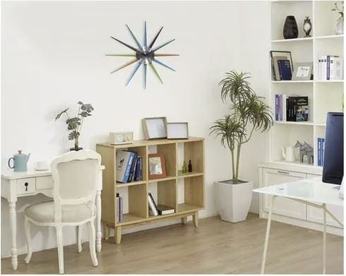
A starburst clock with a multi-hued metallic finish and a silver face elevates ordinary household items from plain to eye-catching. We talked about function and form, and this clock delivers both. The spare lines and muted colors will work in your home office, den, living room, and even the kitchen.
See how the greens, grays, and muted orange in the spires of the clock promote a look that’s totally retro. Guaranteed to look good alongside other artwork from the era.
Tropical Montage
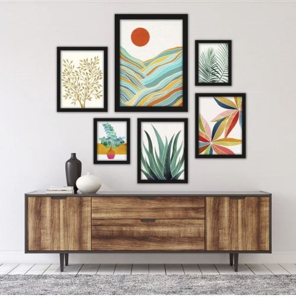
One aspect of mid-century modern is the sense of bringing nature into a room. We’ve mentioned having a gallery wall in one room of your place. This set of six prints accomplishes both ideas – the look of a perfectly coordinated gallery wall and a nod to the era’s colors – the greens, golds, and corals.
Place these tropical prints up on a white, gray, or green wall. Hang them in a cluster, or string them along a wall.
Industrial Geometry
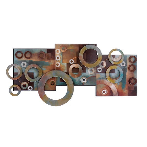
Asymmetrical circles and squares offer a kind of industrial take on the organic shapes typical of mid-century modern wall art. Similar to a print or poster, but more like a sculpture for the wall. This piece has width and depth and will take on different shades as the light in your room changes.
Perfect for a living or dining room, this metallic piece also echoes the natural, muted earth tones so popular during this design period.
Abstract’s Best Colors
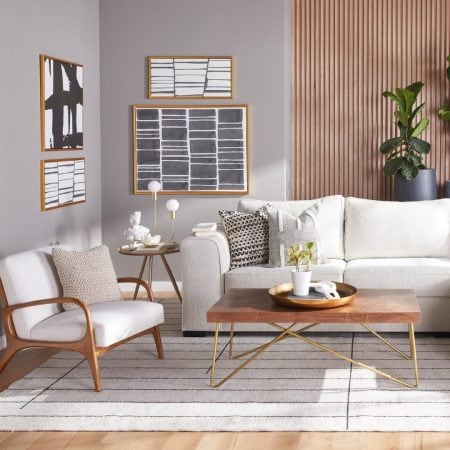
This checks all the boxes for quintessential mid-century modern artwork. Geometric and organic shapes piled up in an abstract design. The earth and natural tones – white, brown, and gray, are beautifully offset by more vibrant colors, bright yellow, deep forest, maroon, and coral.
At 35” by 24”, this is a print to be seen and talked about, so hang it in a prominent place. Picture this in your entry, or over the couch in an airy, white-walled room, or let it take up a wall in a medium or dark gray and allow the colors to spread out and work as a great focal point.
Mid-Century Modern 2.0
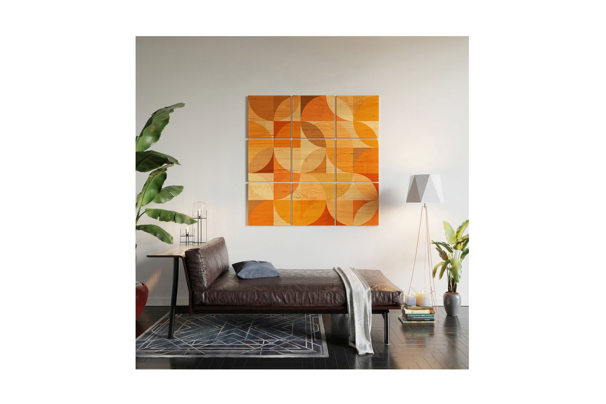
This is a slightly more modern interpretation of the era’s basics. You can see how, with the geometric shapes, the repetition in the texture, plus the neutrals mixing with bolder shades.
Maybe we should call it mid-century modern 2.0. But if atomic sparkles aren’t for you, find the underpinnings of the decorative era in wall décor like this, which may be more to your liking.
Now here’s a statement – a wall-sized mural that checks all the boxes of the mid-century modern style with muted colors and linear flow.
So retro and yet so chic! You can turn a plain white wall from ho-hum to inspired with a floor to ceiling wow factor, that’s sure to launch more great design decisions.
Back to the Future Wall
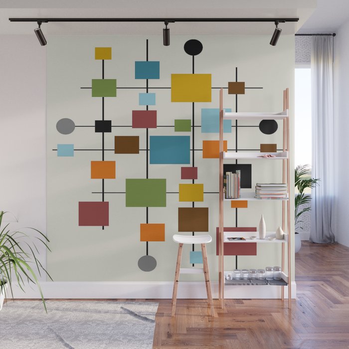
Now here’s a statement – a wall-sized mural that checks all the boxes of the mid-century modern style, not to mention muted colors and linear flow.
So retro and yet so chic! You can turn a plain white wall from ho-hum to inspired with a floor to ceiling wow factor, that’s sure to launch more great design decisions.
A Slice of Americana
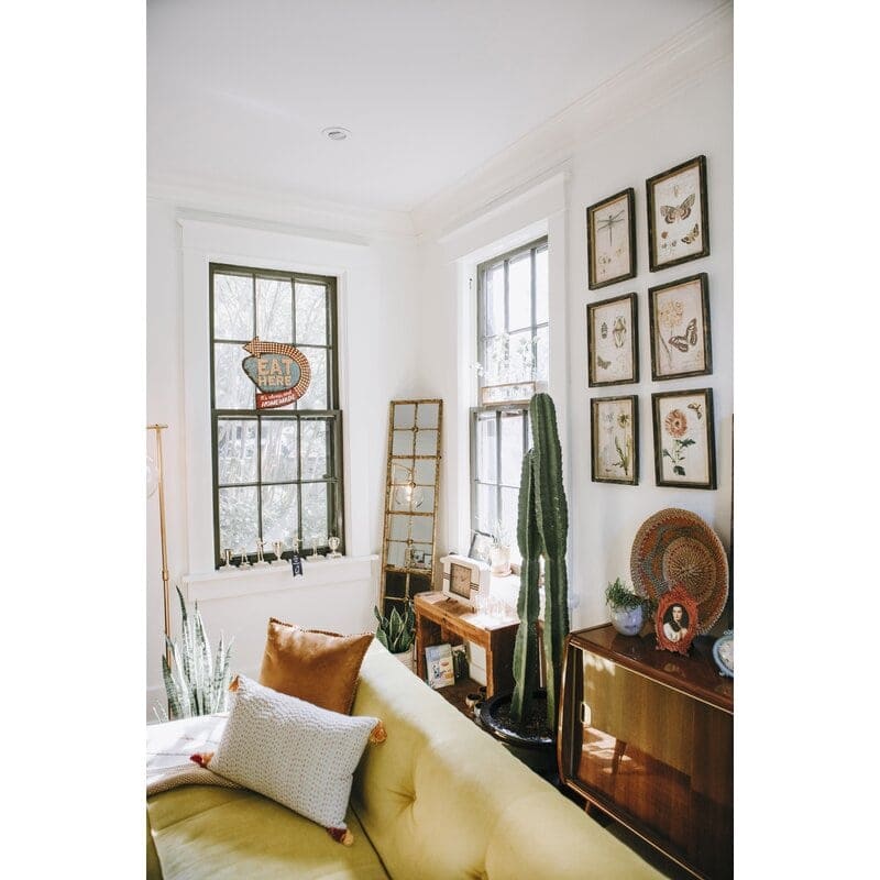
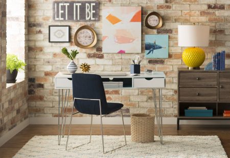
Well, OK, maybe not highbrow art, exactly. But this pastiche of an antique road sign is sure to conjure up long road trips sitting in the back seat, angling for space with your sibs. Even if that didn’t happen, roadside stands were all the rage once upon a time. And you can bring the old memory to the forefront with this great piece of wall art.
Modern Half Moons
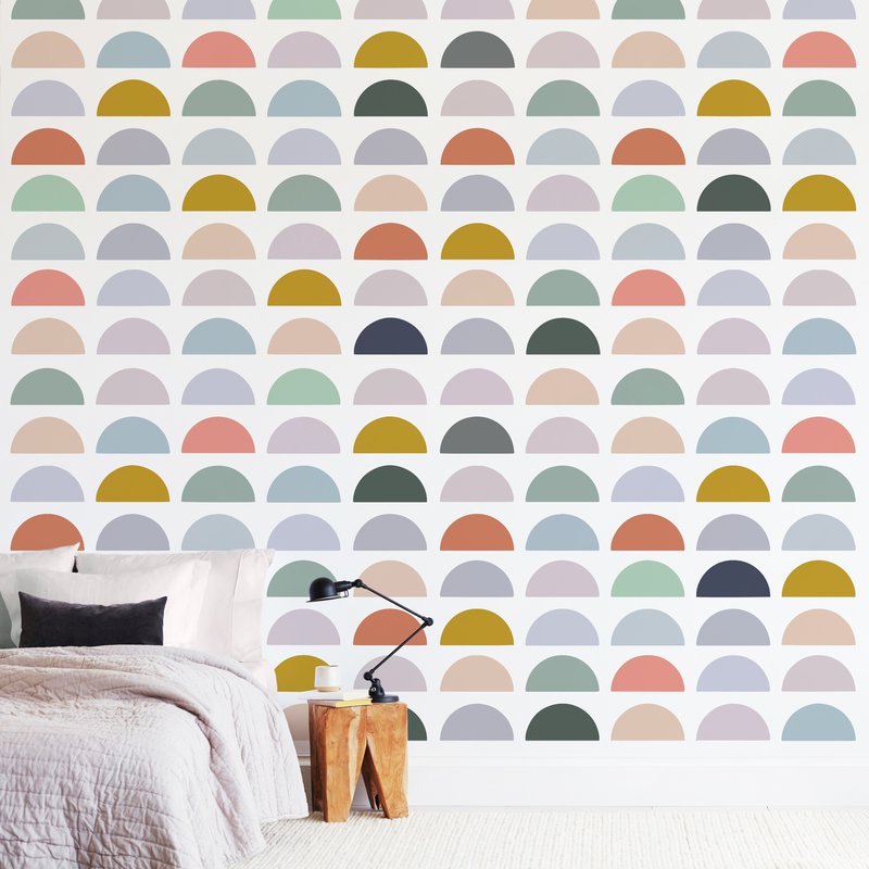
Muted and bold at the same time. Linear and abstract. And its appealing array of earth tones puts this removable wall mural squarely in the mid-century modern category. Use it in a rec room, a kitchen eat-in area, or on any bland, blank wall for an instant update to your home.
Metal Mobile
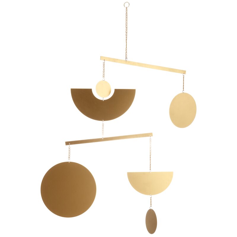
Here’s another kind of decor for your walls, one that moves with airflow and dangles from the ceiling like a beautiful earring. Tone-on-tone metal circles and half-circles shimmy in the breeze and are a perfect complement to other mid-century wall decor. Perfect for porch or entryway, bedroom, or bath.
Form and Function
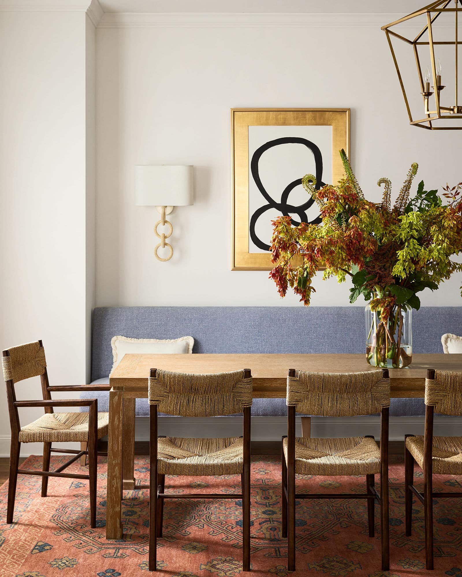
The principles of form and function were usually part of the design process for mid-century modern furniture. But these timeless qualities apply to household items as well. In this case, the working item is a wall sconce – a lamp anchored to the wall.
Practical and beautiful, the corners are rounded. The dangling circles are finished in natural coconut beads. They cover resin rings to create textured, dangling circles. This lamp is tailored and abstract at the same time, and would look great in a dining or living room, or as a pair on either end of a couch in the den.
Easy Decorating with Mid-Century Modern Wall Art
Clean lines. Geometric shapes, usually layered. Earth tones and natural materials.
Mid-century modern is a timeless style that works surprisingly well with whatever décor you have at your place right now. It lightens up an ultra-traditional look with whimsical shapes. It softens hyper-minimalist contemporary settings with layered, organic forms and unexpected splashes of color.
The colors and lines of mid-century modern artwork contrast with the strong, dark shapes of the wood furniture from the same era. The patterns and palette are also complementary, with the mix of earthy neutrals, a touch of metallic on finishes, and strong neutrals from cream and white, to black.
With just a little bit of research, even a beginning designer can pick out pieces from the period, because they’re so easy to identify. Why not get some mid-century modern artwork into your rooms for a dash of nostalgia that makes a huge impact.


