Hale Navy by Benjamin Moore Paint Color Review
Navy Blue is an on-trend color that has been hailed as the “new neutral”. Like your favorite denim, this color goes with everything, especially its fellow neutrals like grays, greiges, creams, tans, and browns.
There’s a range of navy blues out there, but a striking member of this color family is Hale Navy from Benjamin Moore. This intensely dark navy blue has depth and mystery to it. It’s also a perennial favorite with a fanatical popular following among homeowners, designers, realtors, and even furniture flippers.
Despite the nautical name, Hale Navy has so much more use beyond coastal or beach-inspired decor. It’s a timeless color that can be used with any style, and it can lend a subtle touch, a bold statement, or anything in-between.
That said, am I going to miss the chance to make cheesy nautical jokes in this article? Shiver me timbers, never! Come aboard, and let’s set sail with Hale Navy.
What Color is Hale Navy?
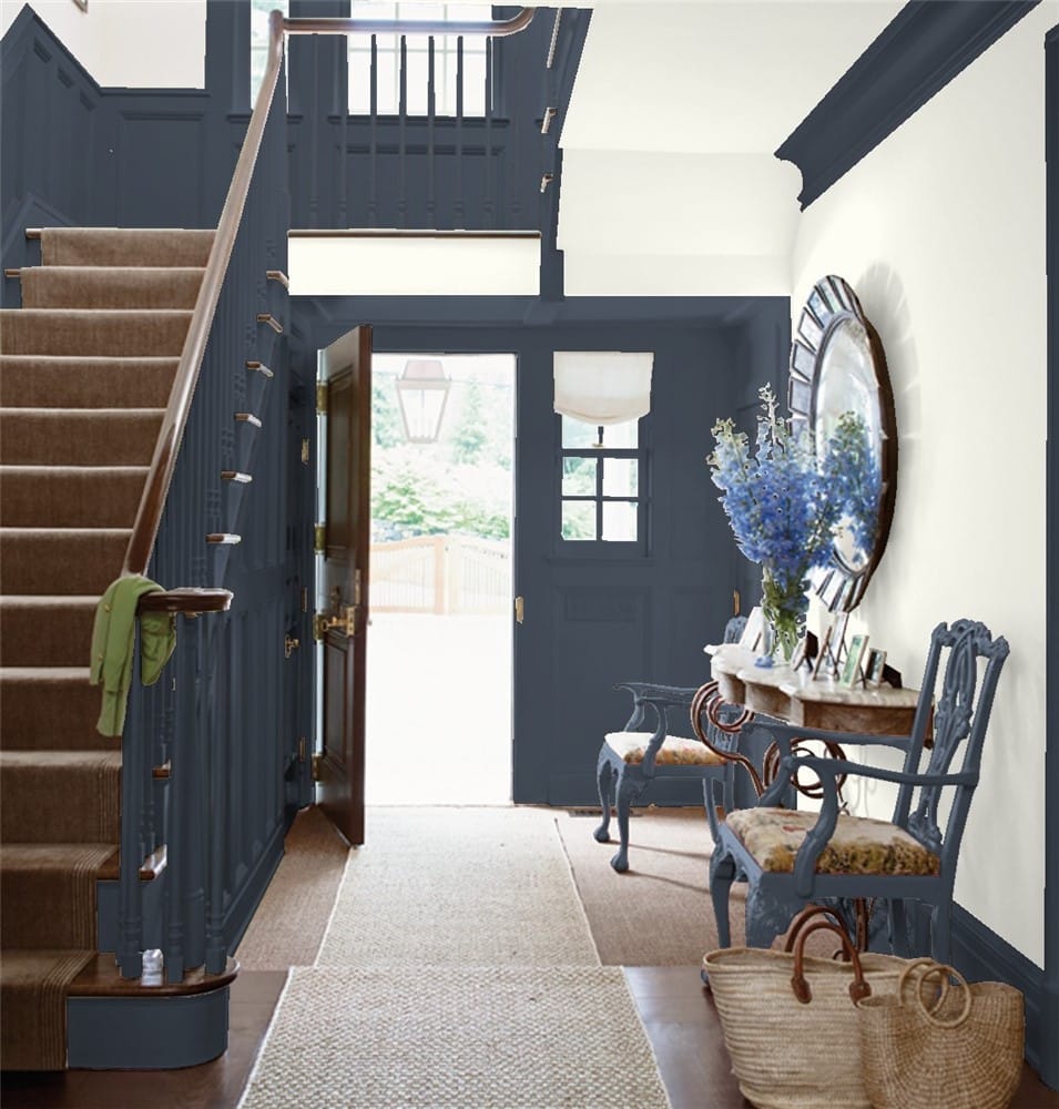
Hale Navy is a deep, extremely dark navy blue with a slate gray slant to it. It’s a classic color with an air of traditional sophistication.
LRV of 6.3
Hale Navy has a light reflectance value (LRV) of 6.3. Light reflectance value runs on a scale from absolute black at 0, to brightest white at 100. This makes Hale Navy a very dark color, in the range of black paints.
What Undertones Does Hale Navy Have?
Hale Navy’s primary undertones are a dark slate gray. This color also has a touch of green in its undertones, but that’s not something you’ll see a lot of.
Is Hale Navy a Warm or a Cool Color?
Hale Navy is a cool color, among the blues, greens, and grays of the color wheel. It will definitely cool down a room, so plan accordingly when deciding how much of it to use in your space.
Where Can You Use Hale Navy?
Hale Navy is an extremely dark color, so if you want to enjoy its blue shades, you need to provide it with enough lighting to shine. There’s a couple ways you can approach this.
If you’re going to use Hale Navy as a main color, be sure to put it in a room with lots of lighting. You can also put it alongside light colors for contrast. Light cream colors and off-whites are good choices for this.
For rooms where you want to avoid getting too dark, use Hale Navy for an accent wall, or on trim, moulding, or cabinets. Hale Navy is great for drawing the eye with a heightened contrast, and for making lighter coordinating colors look bright and fresh.
One area where you’ll always have plenty of light is outside, so don’t be shy about using Hale Navy on exteriors! It can make a handsome color for a front door or shutters as well.
Let’s take a look at Hale Navy out on the open waters to get a fresh catch of inspiration!
Exterior
Hale Navy and White Dove trim make for a timeless combination on this exterior. The addition of the White Dove on the steps is a nice touch.
Taking things in the other direction, a White Dove exterior with a Hale Navy door draws the eye inward. The cool gray trim on the windows is another great companion color for Hale Navy.
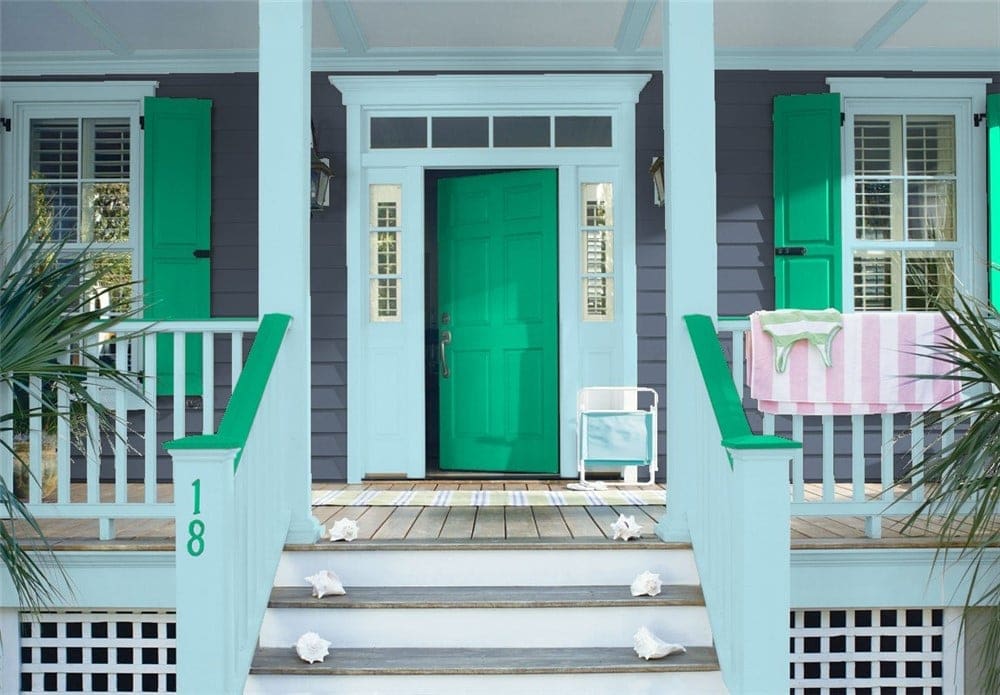
Hale Navy can be the canvas for fun and bright colors, as with this exterior. Its cool and playful companions are Cabana Green and Old Pickup Blue.
Living Room
One way to wrangle a color as dark as Hale Navy is to use it for a focal wall in a lighter room.
Neutrals like brown, tan, and beige make excellent companions for Hale Navy. Natural woods and fabrics are also a great fit.
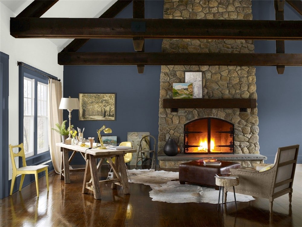
This rustic living room with rich warm leather, stone, and wood, is a beautiful showcase for Hale Navy and Gray Owl.
Kitchen
Hale Navy is a popular choice for cabinets. Metalwork looks bright and shiny next to this deep blue.
Light grays, like this multi-toned hex tile and the Frostine cabinets, really pop next to Hale Navy, which brings out their undertones and adds depth.
Dining Room
This dining room masterfully balances Hale Navy with white, then adds a pop of jungle green in the decor that just really makes the whole room sing.
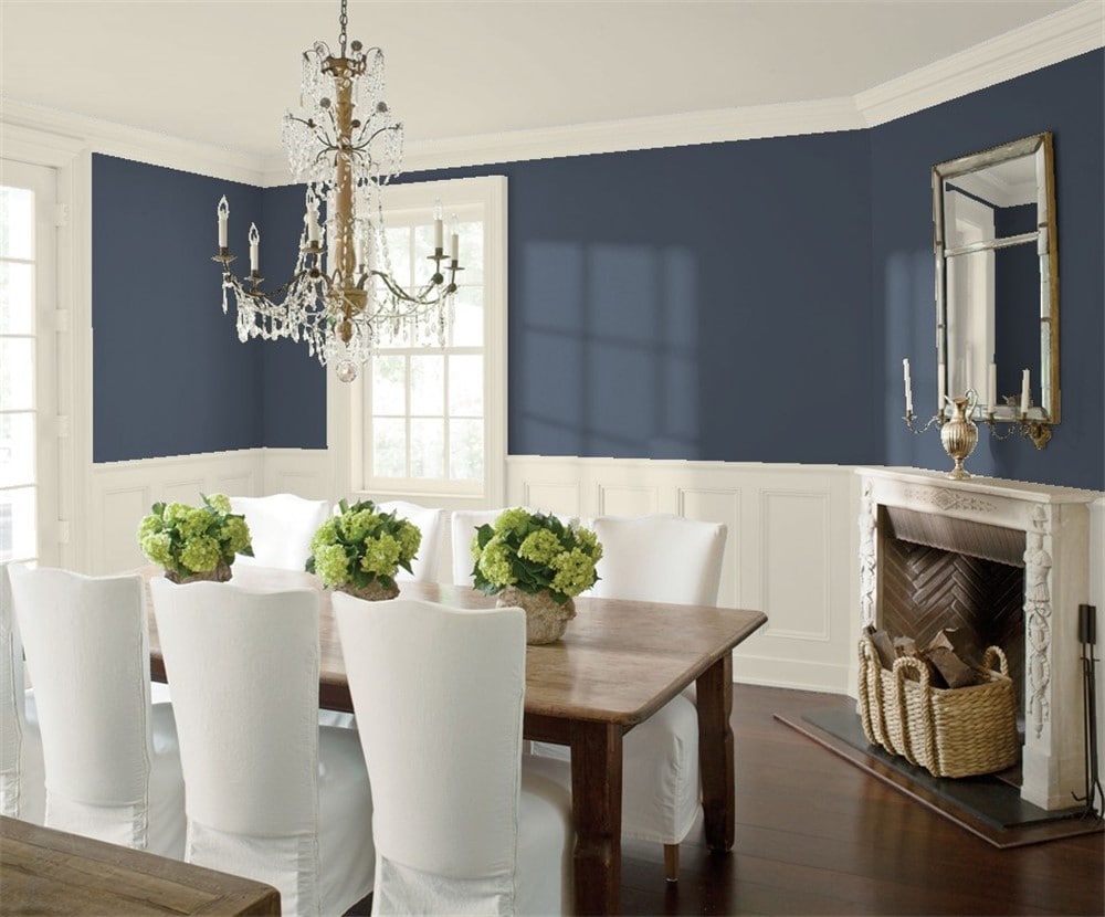
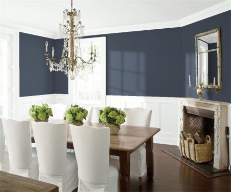
This formal dining room combines Hale Navy and Edgecomb Gray for an elegant contrast.
Home Office
Want to go big and bold with Hale Navy? You can use it as the main color for a room that makes a statement, like this handsome office.
This home office for two is drawn together by Hale Navy shiplap and tan leather chairs. Gold accents add a touch of elegance.
Bedroom
This refreshing take on Hale Navy echoes the color throughout the room with coordinating furniture and a stunning art wall.
If you enjoy Hale Navy’s ability to make a room feel smaller, you can make use of that effect to produce a more intimate space, as with this bedroom.
Bathroom
This bathroom uses bold lines and clean contrasts to create a modern and masculine style.
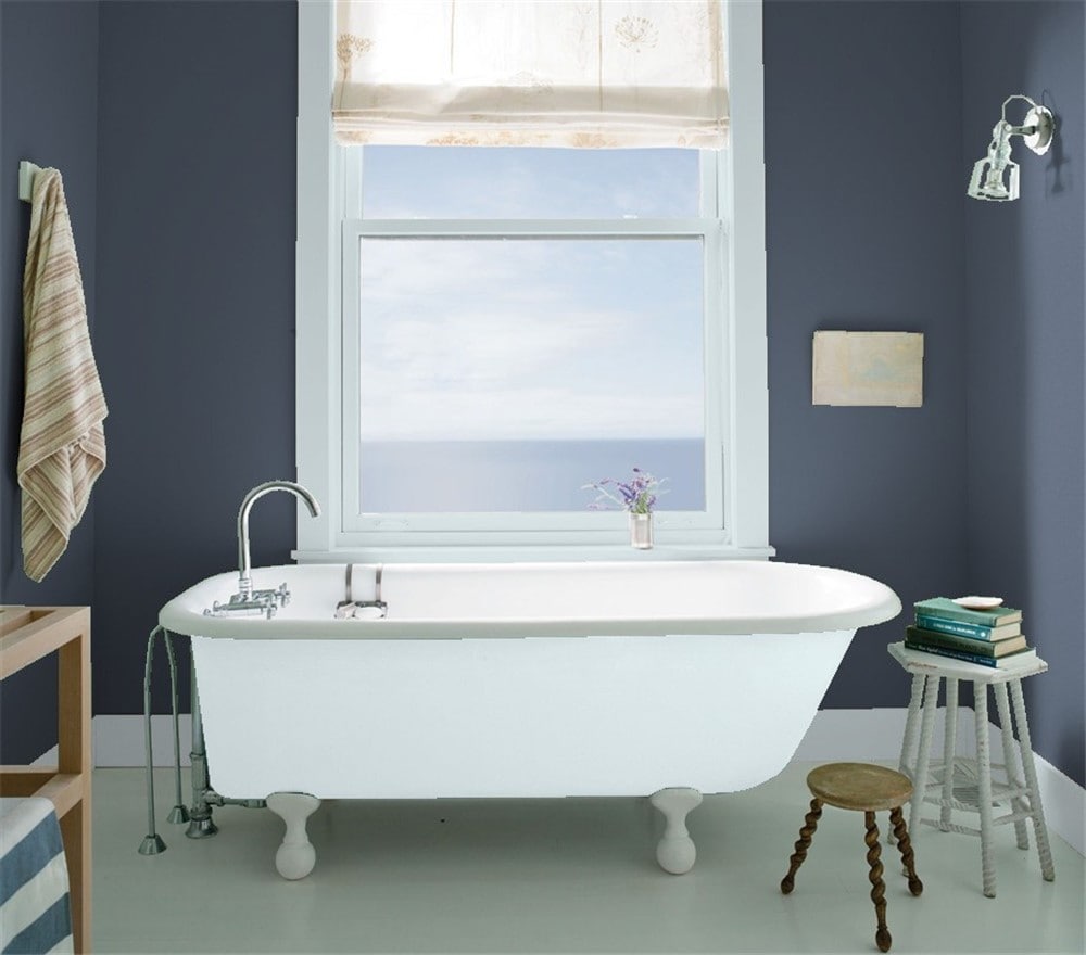
Cool blue Constellation trim brings out the blue tones in Hale Navy in this casual bathroom.
Hale Navy Coordinating Colors
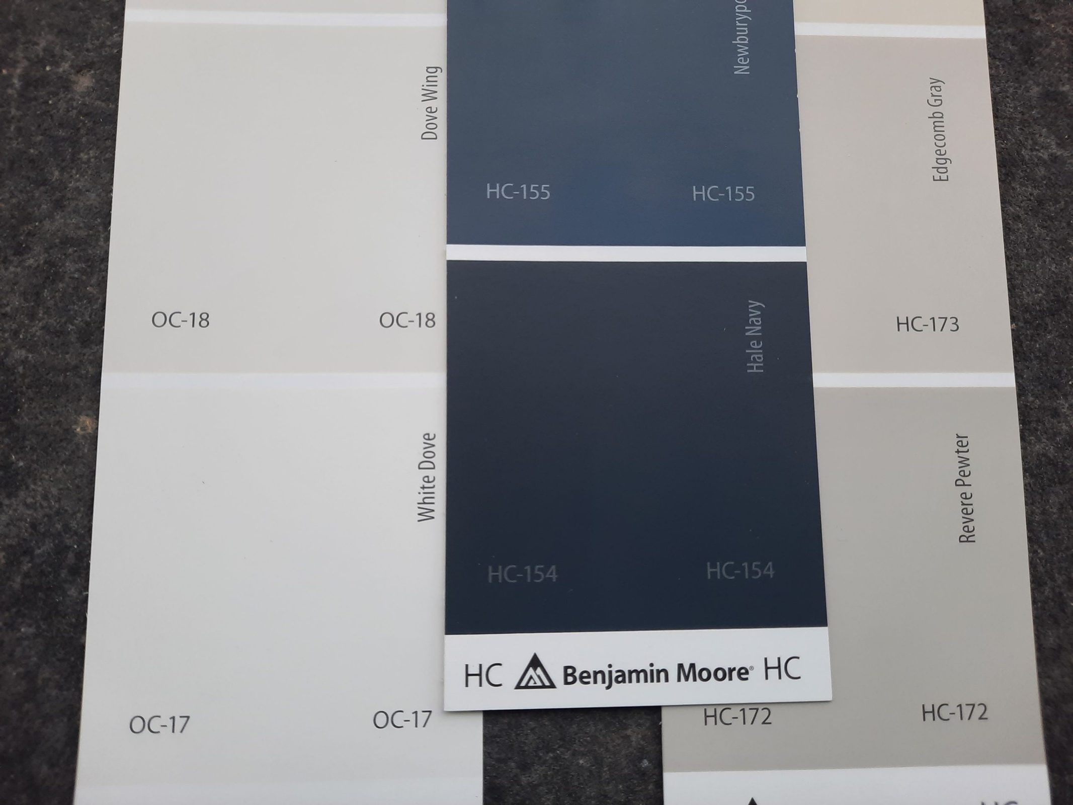
While blue is a color, and it’s on the cool side of the palette, navy blue has a neat trick where it can act like a neutral. After all, everything goes with blue! Thanks to Hale Navy’s low LRV, its dark tones can act like black in that it makes this color even more neutral, giving you more options for coordinating colors.
A classic look is to put white or off-white next to navy blue. Creamy, luminous off-whites are perfect for this job, and Hale Navy will really complement them. Consider my favorite white, Benjamin Moore’s White Dove. Sandy tan colors are another excellent option.
Hale Navy is of course beautiful for coastal decor. Pale seaglass greens, like Sea Salt from Sherwin Williams, are a lovely coordinating option. Coral pinks and peaches are a bright accent that can bring in a romantic or playful touch depending on their tone. You can even go as far as a bright lighthouse red.
Looking for inspiration? Dive into these coordinating color ideas for Hale Navy!
- Revere Pewter by Benjamin Moore
- Edgecomb Gray by Benjamin Moore
- Pale Oak by Benjamin Moore
- White Dove by Benjamin Moore
- Gray Owl by Benjamin Moore
- Palladian Blue by Benjamin Moore
- Constellation by Benjamin Moore
- Coral Buff by Benjamin Moore
- Coral Reef by Benjamin Moore
- Timothy Straw by Benjamin Moore
- Pale Smoke by Benjamin Moore
- Frostine by Benjamin Moore
- Creamy by Sherwin Williams
- Repose Gray by Sherwin Williams
- Mindful Gray by Sherwin Williams
- Sea Salt by Sherwin Williams
- Mint Condition by Sherwin Williams
How Does Hale Navy Compare With Other Colors?
Hale Navy vs Midnight Blue by Benjamin Moore
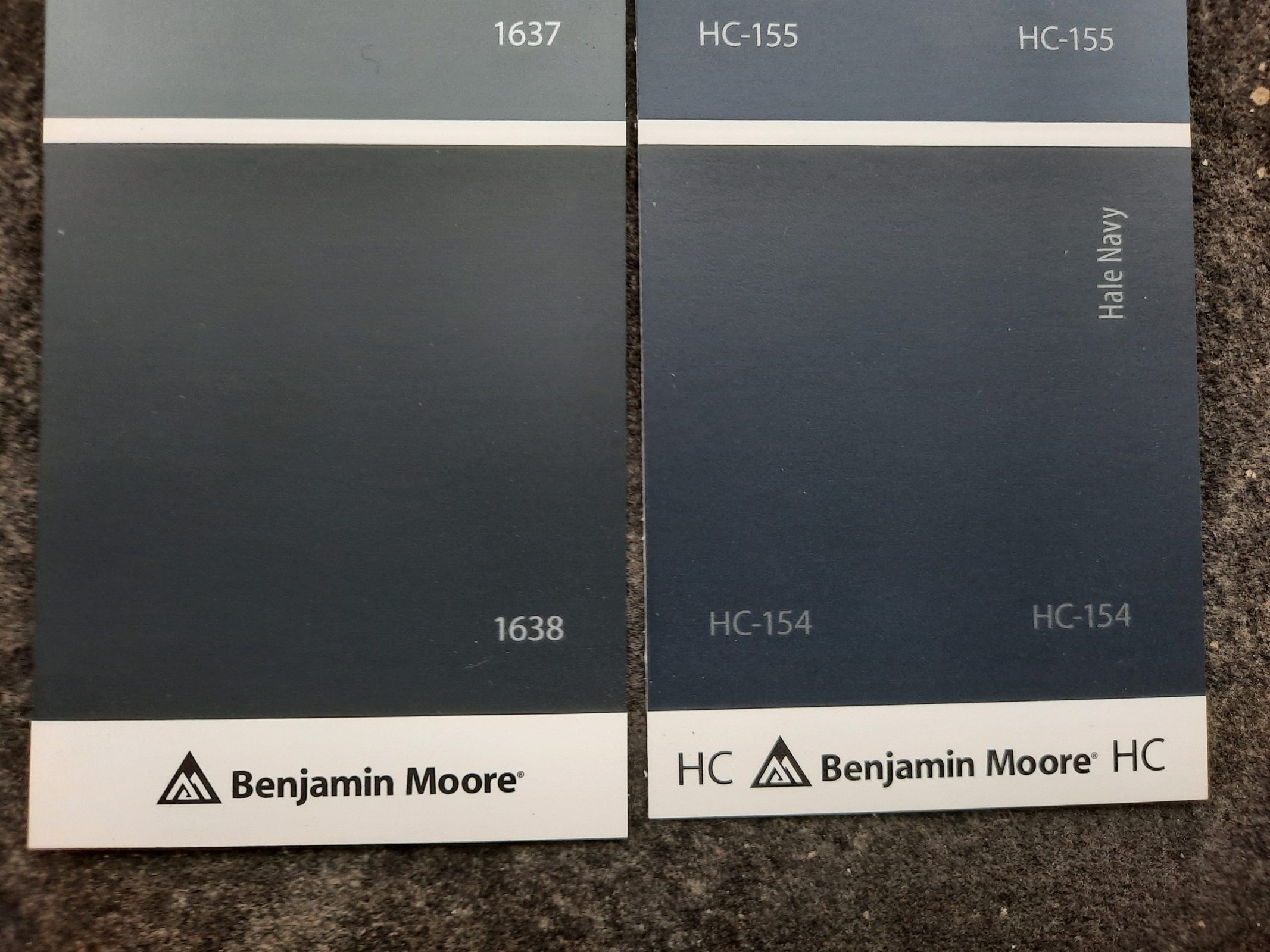
Midnight Blue is another dark blue from Benjamin Moore that has an identical LRV of 6.3 to Hale Navy. The key difference between these two colors is in the amount of gray. Midnight Blue has more gray which gives it a darker appearance than Hale Navy.
Hale Navy vs Charcoal Blue by Sherwin Williams
Charcoal Blue is a color that’s pretty close to Hale Navy, if you’re looking for a Sherwin Williams equivalent. It’s a gray-slanted navy blue with a LRV of 6. Much like Hale Navy, it can come off as more blue under bright lighting, and more slate gray under lower lighting conditions.
Hale Navy vs Sea Serpent by Sherwin Williams
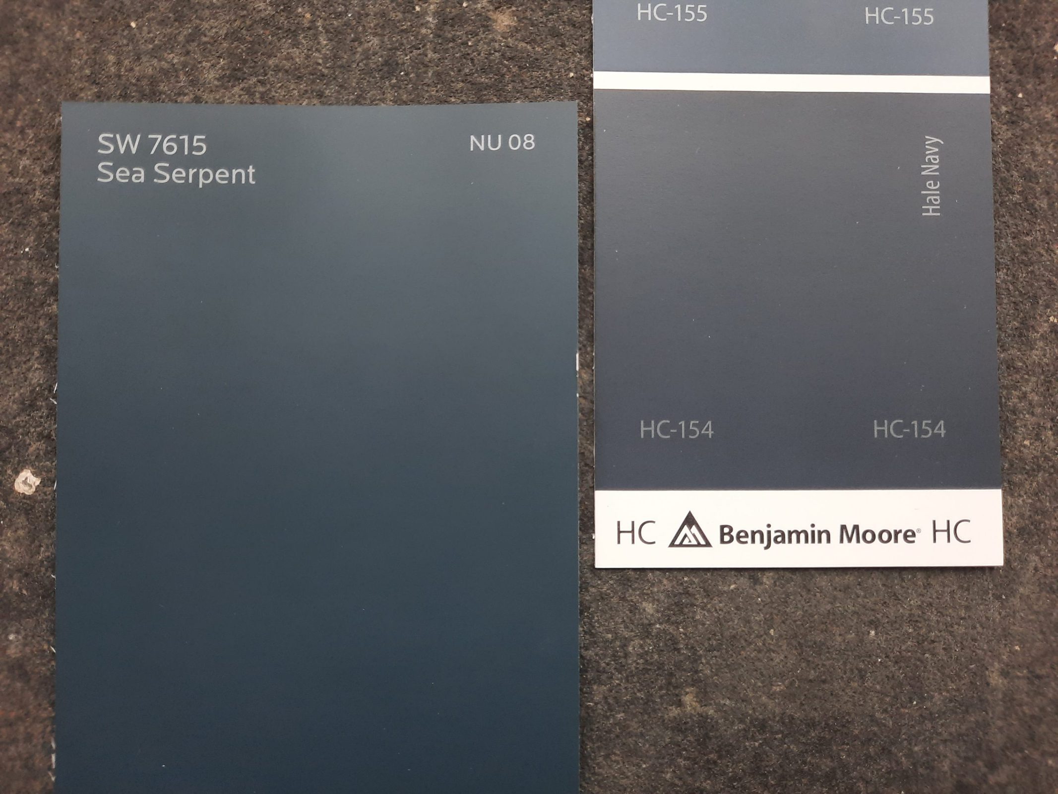
Sea Serpent is a navy blue from Sherwin Williams with a lot in common with Hale Navy. Its LRV of 7 is nearly the same as Hale Navy’s 6.3. It shows its blue side more readily with less of a gray tone than Hale Navy has.
Hale Navy vs Naval by Sherwin Williams
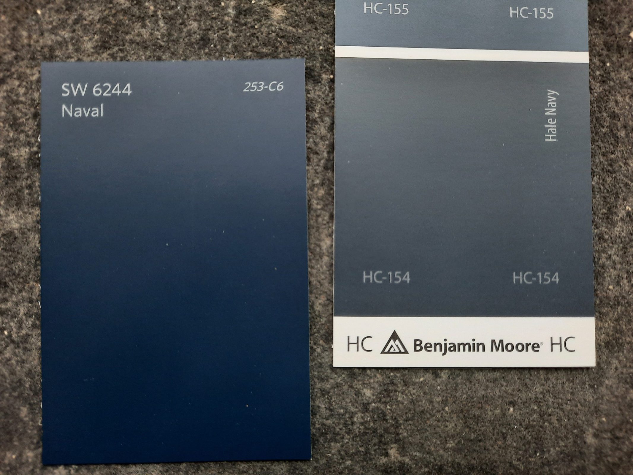
Naval is a navy blue that is actually darker than Hale Navy, but if you look at them side-by-side, you’ll see more of a royal blue tone from Naval. Naval has a LRV of 4, a few notches darker than Hale Navy. This is a very popular color from Sherwin Williams, and it’s part of at least 8 of their featured collections!
Final Thoughts
You might be surprised by the versatility of a color like Hale Navy. Normally you’d expect such a dark and cool color to have a lot of limitations in its use.
But it turns out that navy blues like Hale Navy are the new neutral, combining readily with a wide range of palettes and decor styles. That’s why this classic and sophisticated color is experiencing a new surge of popularity that proves it’s as modern and fresh as it is timeless. So don’t be afraid to dive into the depths with Hale Navy!


