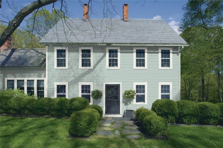
Wrought Iron by Benjamin Moore
Would it surprise you to learn that you can have a lot of fun with a dark, moody color like a charcoal gray? Because you absolutely can!
As any diva can tell you–though of course, they may not admit to it–letting yourself get dramatic can be wonderfully fun.
Charcoal grays are also neutral colors, which means you can bring out all your favorite colors to play with them. What’s drama without an audience?
Today we’re going to take a look at an inky-dark charcoal gray that will give you plenty of opportunities to express yourself: Wrought Iron from Benjamin Moore.
What Color is Wrought Iron?
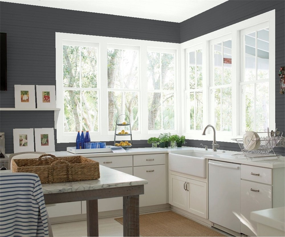
Wrought Iron is an extremely dark charcoal gray color. It’s dark enough to function as a black, but there are (some!) darker black paints out there.
LRV of 8.17
Wrought Iron has a light reflectance value (LRV) of 8.17.
Light reflectance value is a scale designed to measure how bright a color is, and ranges from absolute black at 0 to sheer white at 100. The lower the number, the darker the color.
What Undertones Does Wrought Iron Have?
Wrought Iron has slate gray and inky blue undertones. It’s not a flat black, and it has a moody or stormy appearance compared to a black paint color.
Is Wrought Iron a Warm Color or a Cool Color?
Wrought Iron is dark enough that it’s essentially neutral, but its slate and blue undertones do give it a slightly cool slant.
Where Can You Use Wrought Iron?
It might surprise you just how many places you can use Wrought Iron. This is a big statement kind of color, so a little goes a long way–but for some styles, that’s exactly what’s called for.
Wrought Iron is of course an extremely dark color. There’s a new trend towards dark styles, where black or charcoal gray is the primary wall color. You can absolutely use Wrought Iron that way.
But if you’re dealing with small spaces, or concerned about things getting too dark and cavern-like, it’s also easy to temper Wrought Iron. It can be used as an accent wall, or you can use light ceilings and floors to balance the darkness of Wrought Iron walls.
Don’t forget decor elements when styling Wrought Iron. Using bright and colorful decor, sleek metals, or lots of whites, creams, and other light neutrals, will each give a room a different personality and feel.
Let’s dive into the dark depths of Wrought Iron and see how it looks in action!
Living Room
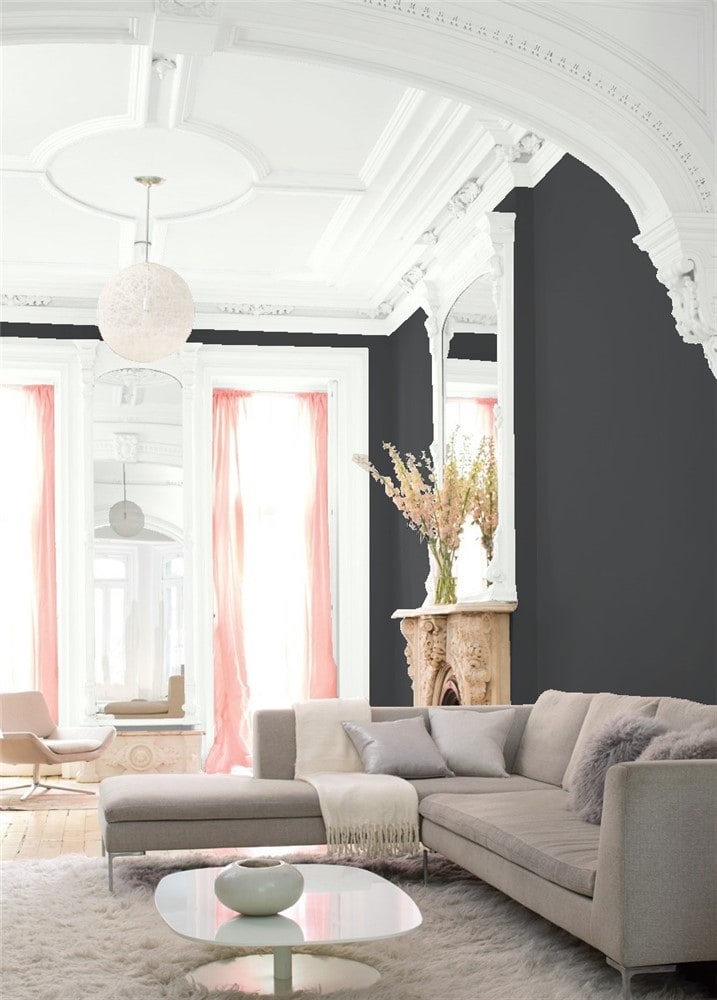
Wrought Iron adds drama and elegance to this soft and romantic living room.
Kitchen
Wrought Iron cabinets make a bold statement in this modern kitchen.
Not all your cabinets have to be the same color! This kitchen shakes things up by using Wrought Iron below and Super White on top for maximum contrast.
Dining Room
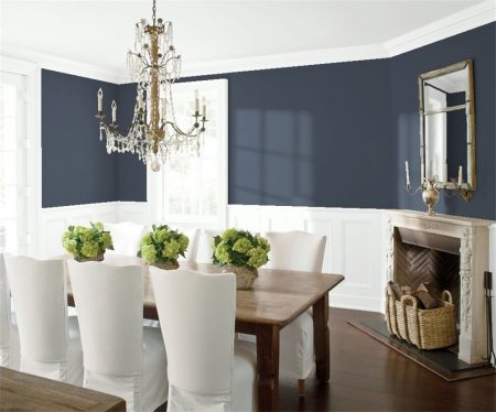
You frequently see Wrought Iron used with white ceilings, but this dining room reverses that idea, using a Wrought Iron ceiling to showcase its chandelier.
Home Office
This home office space is pulled together with a geometric Wrought Iron focal wall that echoes the lines in the lighting fixture.
Bedroom
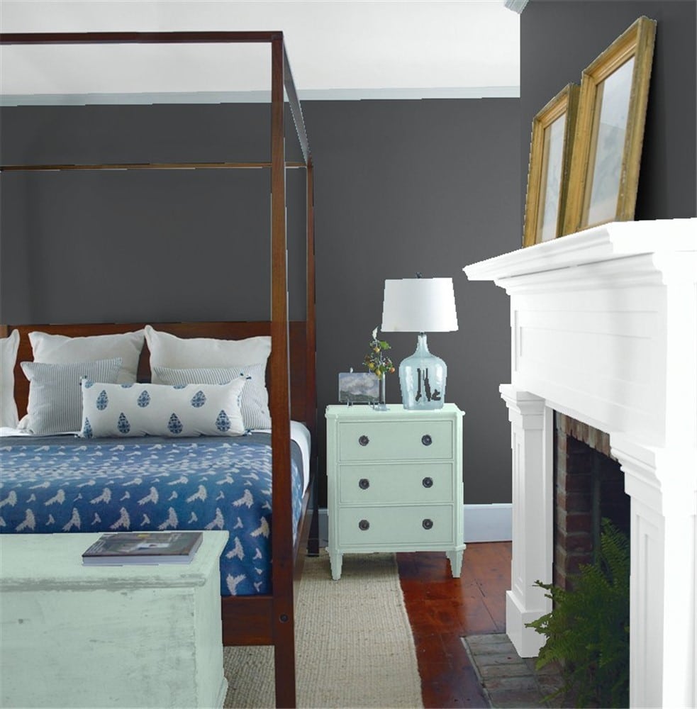
The blue and gray undertones in Wrought Iron play nicely with the array of blues in this bedroom’s decor.
Bathroom
Wrought Iron works with gold, white, and marble to create this chic and stylish modern bathroom.
This bathroom goes for full drama, with Wrought Iron paneling and lots of antiqued gold. Even though bathrooms are smaller spaces, you can use dark colors like Wrought Iron in them successfully.
Entryway
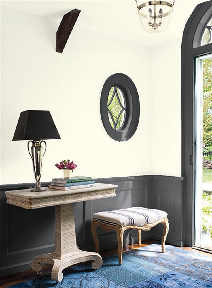
This two-toned entryway takes advantage of Wrought Iron’s ability to serve as a backdrop for decor of any color.
Exterior
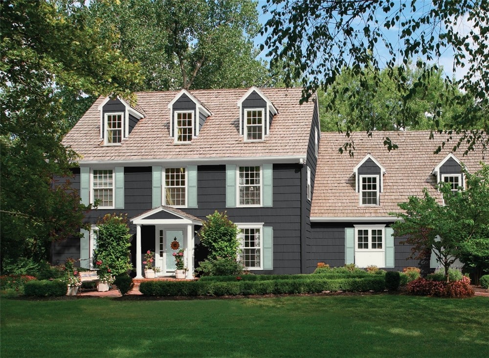
Under direct sunlight, it’s easy to see Wrought Iron’s mysterious depths, as you can on this exterior.
Wrought Iron Coordinating Colors
You can’t go wrong choosing coordinating colors for Wrought Iron, except perhaps by surrounding it with other colors as dark as itself. As a neutral, it’s able to combine with anything.
Benjamin Moore even makes the bold suggestion of pairing this spooky slate black with Jack O’Lantern orange! If you can go there, then any palette is fair game.
Black looks fabulous in combination with white and gray. You can accent this with metalwork, especially gold, for an elegant look.
Wrought Iron can serve as the neutral backdrop for pops of your favorite bright colors just as readily as a white or greige color can. Consider fun, bright colors like apple green, teal, candy pink, or sunny yellow, which will all stand out vividly against Wrought Iron.
If you want to tame down Wrought Iron’s dramatic influence, have it play accent or trim to a lighter wall color. A light gray will keep the moodiness and coolness of Wrought Iron, while a warmer off-white would downplay those traits.
You can combine Wrought Iron with any of your favorite colors, but if you’re looking for a place to start, here’s some inspiration:
- Gray Owl by Benjamin Moore
- Mt. Rainier Gray by Benjamin Moore
- Edgecomb Gray by Benjamin Moore
- White Dove by Benjamin Moore
- Jack O’Lantern by Benjamin Moore
- Palladian Blue by Benjamin Moore
- Healing Aloe by Benjamin Moore
- Solitude by Benjamin Moore
- Classic Light Buff by Sherwin Williams
- Blithe Blue by Sherwin Williams
- Ice Cube by Sherwin Williams
- Passive by Sherwin Williams
- Alabaster by Sherwin Williams
- Camelback by Sherwin Williams
- Watery by Sherwin Williams
- Coral Clay by Sherwin Williams
How Does Wrought Iron Compare With Other Colors?
Wrought Iron vs Iron Mountain by Benjamin Moore
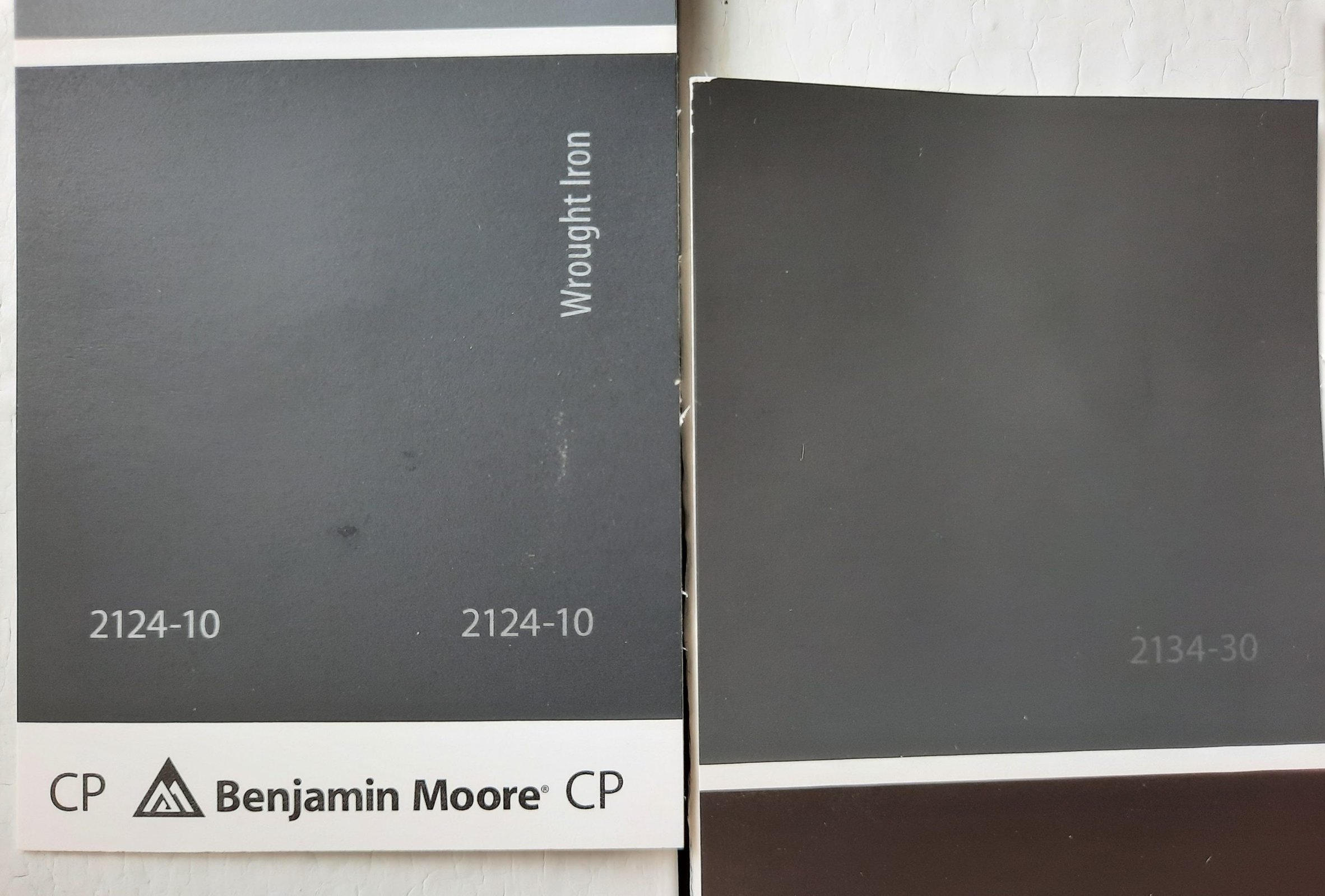
Benjamin Moore describes Iron Mountain as a soft black that isn’t too warm or cool. It looks more silver than Wrought Iron. Iron Mountain is a touch lighter than Wrought Iron, and when you’re this close to the end of the LRV scale, even just a few notches can make a meaningful difference. Iron Mountain has a LRV of 10.96.
Wrought Iron vs Graphite by Benjamin Moore
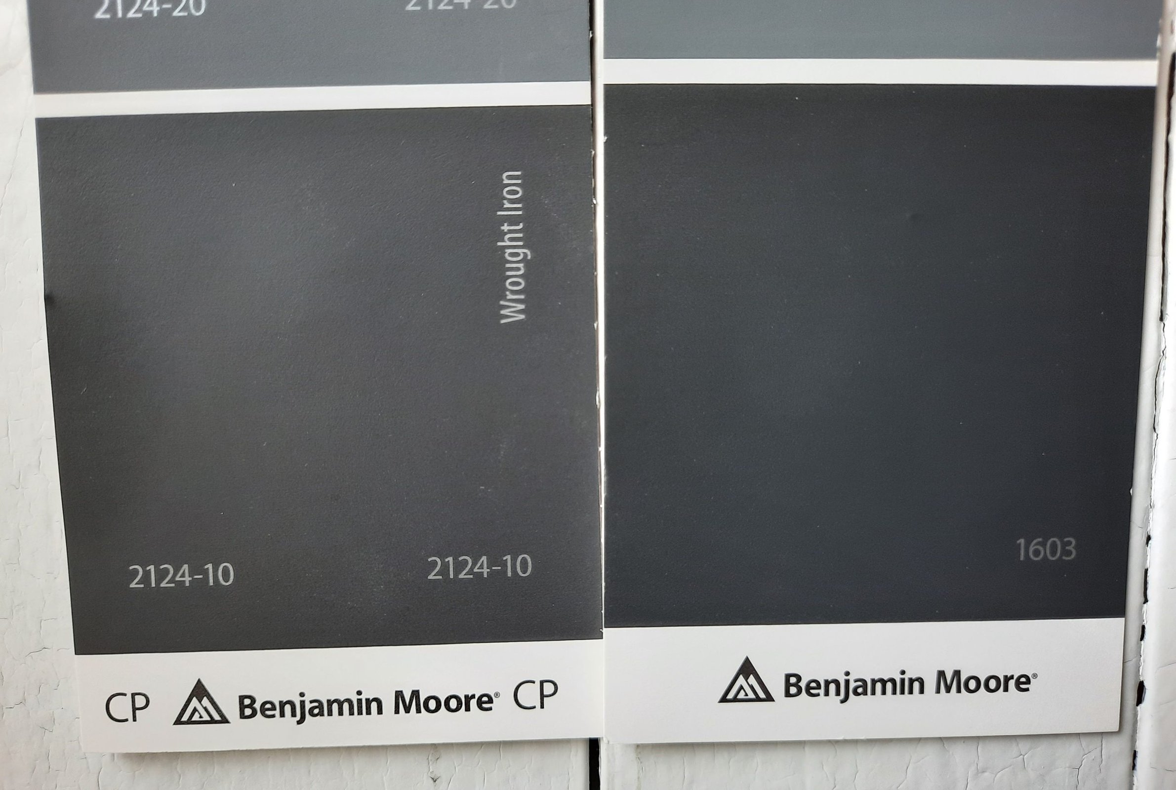
Graphite is so visually similar to Wrought Iron that it’s very difficult to tell them apart. But Benjamin Moore categorizes Graphite as a deep gray, versus Wrought Iron which it considers to be a black. They share their slate gray and blue undertones. Graphite has a LRV of 7.59.
Wrought Iron vs Iron Ore by Sherwin William
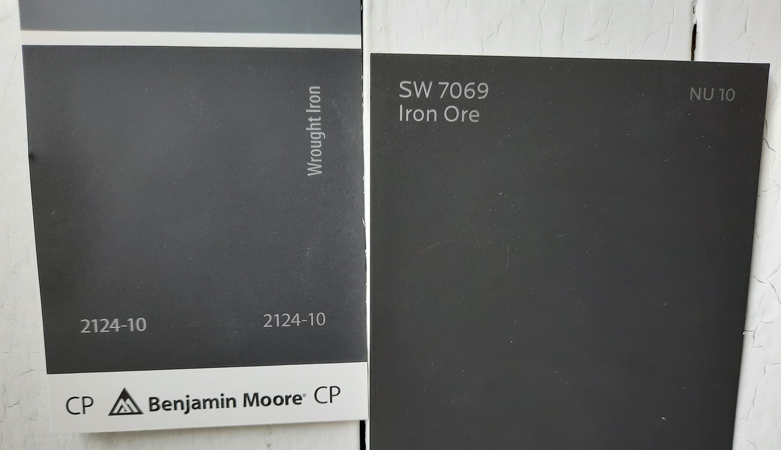
Iron Ore is an extremely dark charcoal gray that’s still visibly different from a black paint color. It’s slightly more neutral and less blue than Wrought Iron. It’s also a little darker, with a LRV of 6.
Final Thoughts
Wrought Iron isn’t just a flat black paint–it’s a lot more interesting than that! This deep charcoal gray brings personality to the table with its blue and slate undertones. Yet it’s still a versatile neutral that goes with anything, and goes anywhere you dare. Wherever you use Wrought Iron, it will never be boring!


